Movie Posters & Logos
Creating a plot, logo, movie poster, and tag lines from only a title can pose a challenge. Three logos below are a sample of 20 concepts and each movie poster experimented with different layouts, while maintaining the feeling of a family drama/romantic comedy.
Plot
David Carmichael , a recently divorced father of four is found picking up the pieces after a failed marriage. His oldest son Henry, who was adopted at age three, is now curious where his birth mother is. Soon David and Henry find themselves on a journey that brings them to the door of David’s college sweetheart, Genevieve, who is also Henry’s birth mother. Leave it to fate to bring these two paths together.
Logos
The goal was to achieve a family comedy/drama, similar to a Nancy Myers (The Holiday, It’s Complicated, etc.) film. My goal was to create a clean, classic look while showing two things coming together — similar to the plot line. In the logos created, I interlocked the letters, used an arrow icon, or created a continuity between the letter structures to merge the words of the title into one.
Posters
After the logos were created, it was time to further develop the film’s concept into movie posters along with tag lines. The poster at the top of the page was created to show a family’s scrapbook from the past and present. This was to convey to the audience that there was a long history between this man and woman before the child came into the picture (no pun intended).
The poster below was created with the intention to showcase who the characters are, and use icons to represent the plot bringing them back together. Since it was a family drama/comedy, I wanted the characters to have an inviting and personable look, but still have their own personality.

Creative Job Application
If you watch HGTV, you know about Chip and Jo. The brand that they've created for Magnolia home through their show Fixer Upper has not only changed their lives, but Waco's too. When there was a posting from Magnolia Homes for a creatives job fair, I had to apply. The requirement was to create a unique piece of content that would catch their eyes and show off what you have to offer Magnolia.
Above is a 60 second stop motion video submission that was created on a tight deadline. All the lettering was done in one take, over the course of 20 minutes.

Logos & Promos
Over the past couple of years, friends have come to me in need of creating logos or promotional content for their new or small businesses. This has ranged from logos for photography and college consulting, to Black Friday ads.
The logo above was to be used for a photographer's website, but could also be deconstructed so that the script portion of the logo could be used as a watermark. The photographer focuses on nature landscapes, so I wanted to create a simple, organic logo that fits seamlessly into her photographs and brand.

A past employer was creating her own college admission consulting business, and was in need of a simple yet inviting logo. She wanted it to convey the excitement that a student feels when they open their acceptance letter.

My most recent experience was as a freelance graphic designer for a small, online boutique. The owner asked for Black Friday promotional content for her sale, and needed it to transfer to her online page, as well as Facebook banners and profile pictures. My goal was to create the feeling of the upcoming holiday, while showing off the bag with an everyday look. The snowflake graphics create a transition, instead of a harsh contrast between the photograph and sale information.

The Tei Pei Problem
As a part of the National Student Advertising Competition, our task was to reintroduce the brand Tai Pei Asian Food. The following are selected pages from our plans book which was submitted and took home second place in the district competition. My role on the creative team was to develop our campaign idea into commercial story boards, copy lines, retail activation concepts, and other marketing plans to raise brand awareness.
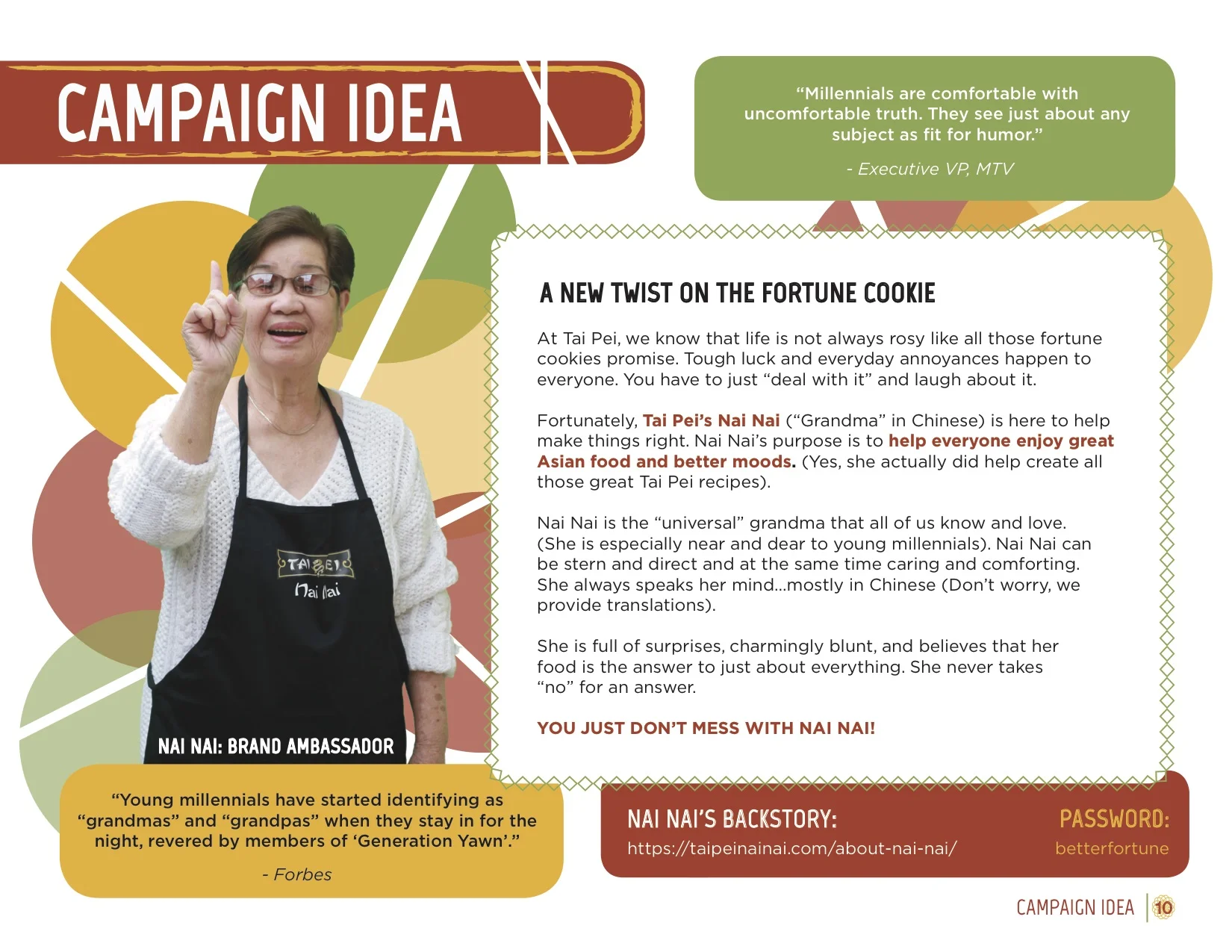
As a member of the creative team, we brainstormed for weeks on how to make Tai Pei relevant to the young millennial. Our final execution centered on "tough luck" scenarios through humor and our brand ambassador: Nai Nai.
Nai Nai is the grandma that tells it like it is. She holds nothing back, and gives you the tough luck responses you deserve, whether you want to hear them or not. Nai Nai still has love for the Tai Pei customer, and ultimately aims to make sure she offers the right mix of her blunt humor and a delicious dish of Tai Pei food.

The creative team was dealt the task of commercials, and the following are two of the four examples of story boards that were created for personas that we found related most to our brand.
The concept that I developed was the "party owls," which was created into an actual video and used in our final presentation to the judges. Being a college student, I wanted to add an all too relatable situation and exaggerate it for humor.

For this part of the campaign we needed to create retail activation concepts that would draw the customer to the point of purchase. I created copy lines and the idea of a fortune cookie coupon dispenser to add a different experience in the grocery store. To include our tough luck mantra with an old time saying, I came up with the copy line "My dear, crying over spilt milk is only allowed in the dairy section." This copy was to be posted as our freezer door stickers to draw the consumer to Tai Pei.

We all know the best stores are the ones with the free samples. After working with focus groups, we concluded that millennials are the most responsive to in-store experiences.
This part of our plans book was dedicated to sampling ideas to increase our consumer base, and I created the copy line for the sampling booth for Nai Nai: " Do what I say, take one from the tray."

Our team placed second in our district, and was unique in our brand ambassador concept. It allowed me to use my strengths of being both pragmatic in our brand strategy/direction, and my creativity in developing copy lines and in-store concepts.

Minimalist Portraits
After an assignment in a design course to create a portrait on Adobe Illustrator, I was hooked. Being able to produce portraits that are of icons or personal pictures allows me to strip a photo down to the details that I want to include. All shapes were outlined by hand using the pencil tool, and then the color was gaged through the eyedropper.

Black & White of my Cocker Spaniel mix, Tutter

A Royal with the Ultimate Poker Face

Iconic Miley Cyrus

A Glass of PositiviTEA
Over the years my hand lettering has combined itself with other mediums, and my love for puns. I had taken photos for a cookbook project, and this picture of iced tea was one of my favorites. After seeing the "positiviTEA" pun in one of my sketchbooks, I instantly thought back to this photograph. It's eye-catching not only from the refreshing glass of tea, but also the lettering and creative use of words surrounding it.
Check out some of my other pun-inspired creations below.


Saving the Date for an Adventure
When a friend came to me in need of an invitation for a fundraising gala, I was more than happy to help. This organization hosts an annual summer camp for children whose parents are battling cancer, so the goal was to create an invitation and "save the date" that was formal yet with a young and outdoor style.
Both the invitation and save the date were created on Adobe Illustrator. I altered the opacities, sizes, and colors of the pine trees to create a bottom border. This supports the information, and the negative space above is filled with stars to balance the trees below.

A Family Huddle
The past four years of my undergraduate life were consumed by rowing. Looking back it was the most rewarding experience and I am thankful that I had the opportunity to compete at the D1 level and make life long friends.
At our "End of the Year" banquet, the seniors were given one task: leave the team with something to remember you by. This could be a speech, video, or anything you could create that is unique to you. Creating a minimalist portrait on Adobe Illustrator is something I've enjoyed in the past, so why not make one that captures the team that means so much to me?
This portrait was transferred into a poster sized print, as well as stickers that the team could carry with them.

I started with a photo taken during our fall season, after a freshman boat won their race. This photograph resonated with me because it captured the younger athletes on our team who still have years left to compete, and had just completed a race that left them hungry for more.
The goal was to keep the necessary details to recognize who was in the portrait but simple enough that when those girls graduate, it's still relevant for the future team. This is why there are more details placed in the apparel, and less in the facial and landscape features.
The last detail that I wanted to include was what our team's new foundation was built on: family. The coaches and culture of the team changed over the years and created more of an "us" rather than "me" mindset. I was known for my hand lettering among teammates, so it only seemed right to add a detail in the clouds that spoke to what the future of USC rowing is about.

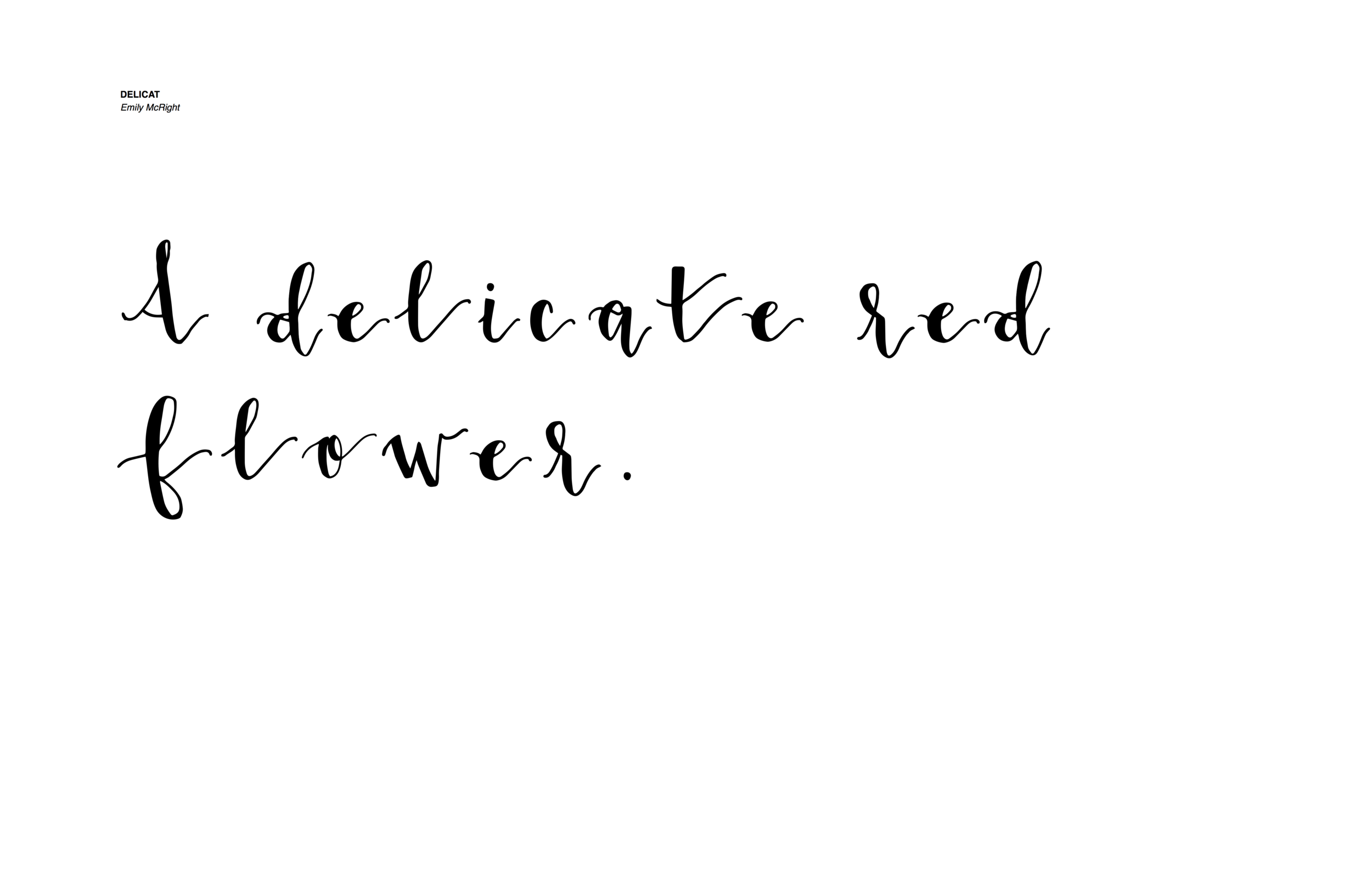
"Delicat" Original Typeface
After years of putting my (brush) pen to paper, it was time to create an official typeface for my lettering style.
While I can create many different type styles by hand, this typeface went back to what I have done the longest and where I feel most comfortable. My goal was to create a "delicat" (french for delicate) typeface that had a contrast of fine lines and bold downstrokes. This was to create a feminine type that is strong and can stand out on its own.